Case Study: Increasing Enrollment in Quit-Smoking Programs
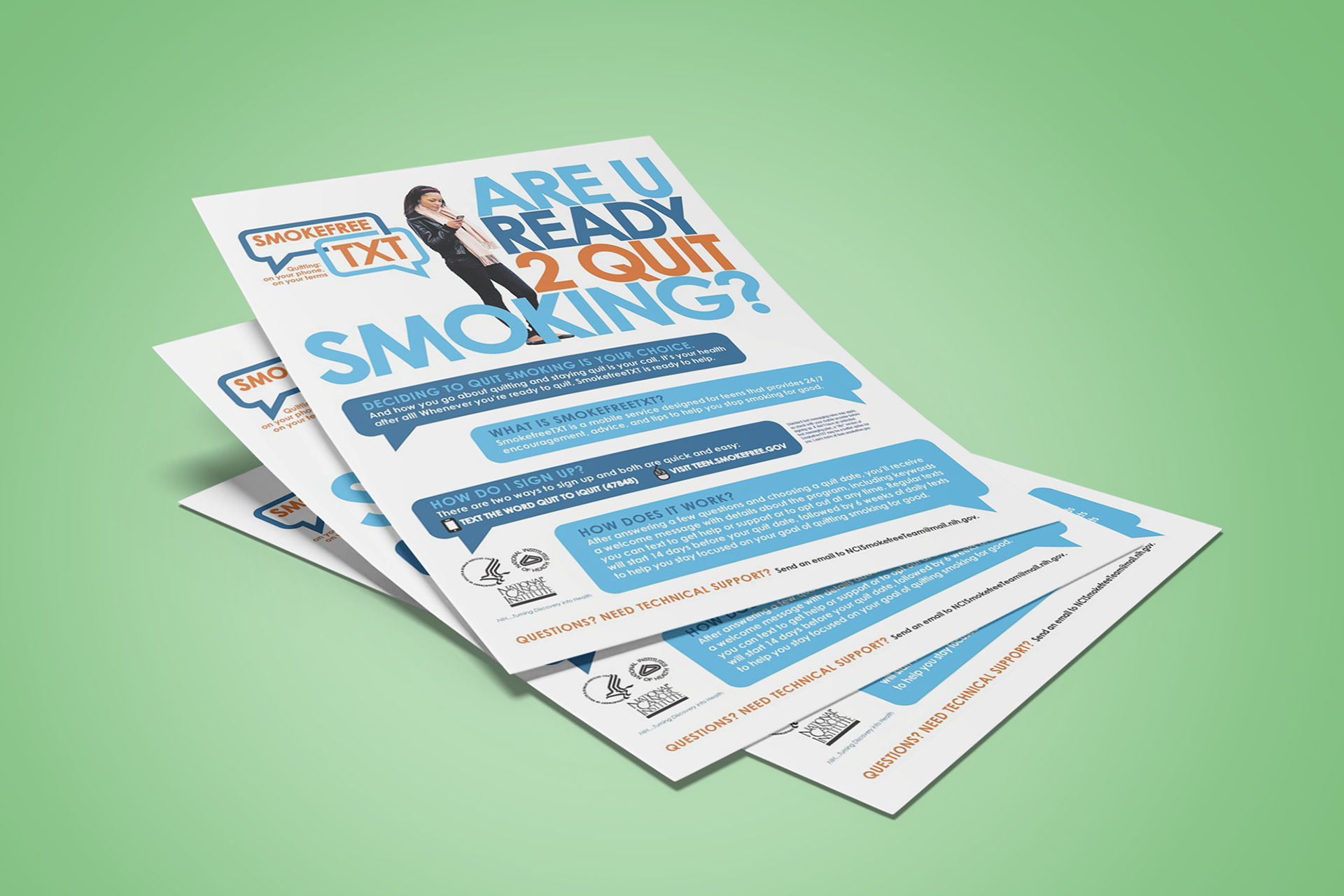
Problem: Enrollment in the Smokefree TXT program lagged because the sign-up process was unclear and under-promoted. Smoking cessation programs often failed to resonate with younger smokers, who preferred digital-first solutions.
Solution: We created a flyer which used modern design, bold typography, and direct calls-to-action with approachable visuals that emphasized simplicity. The design features playful “TXT” branding, and SMS-based action steps, aligning with younger audiences’ mobile habits. It also highlighted multiple support options (texts, phone lines, online help), making clear that assistance was available in different formats.
Impact: Among participants under 30, enrollments increased by 60%. Social media mentions of Smokefree TXT nearly doubled, boosting campaign awareness. Calls to Quitline rose by 30%, and new enrollees reported accessing more than one support resource.
Case Study: Building Community Presence
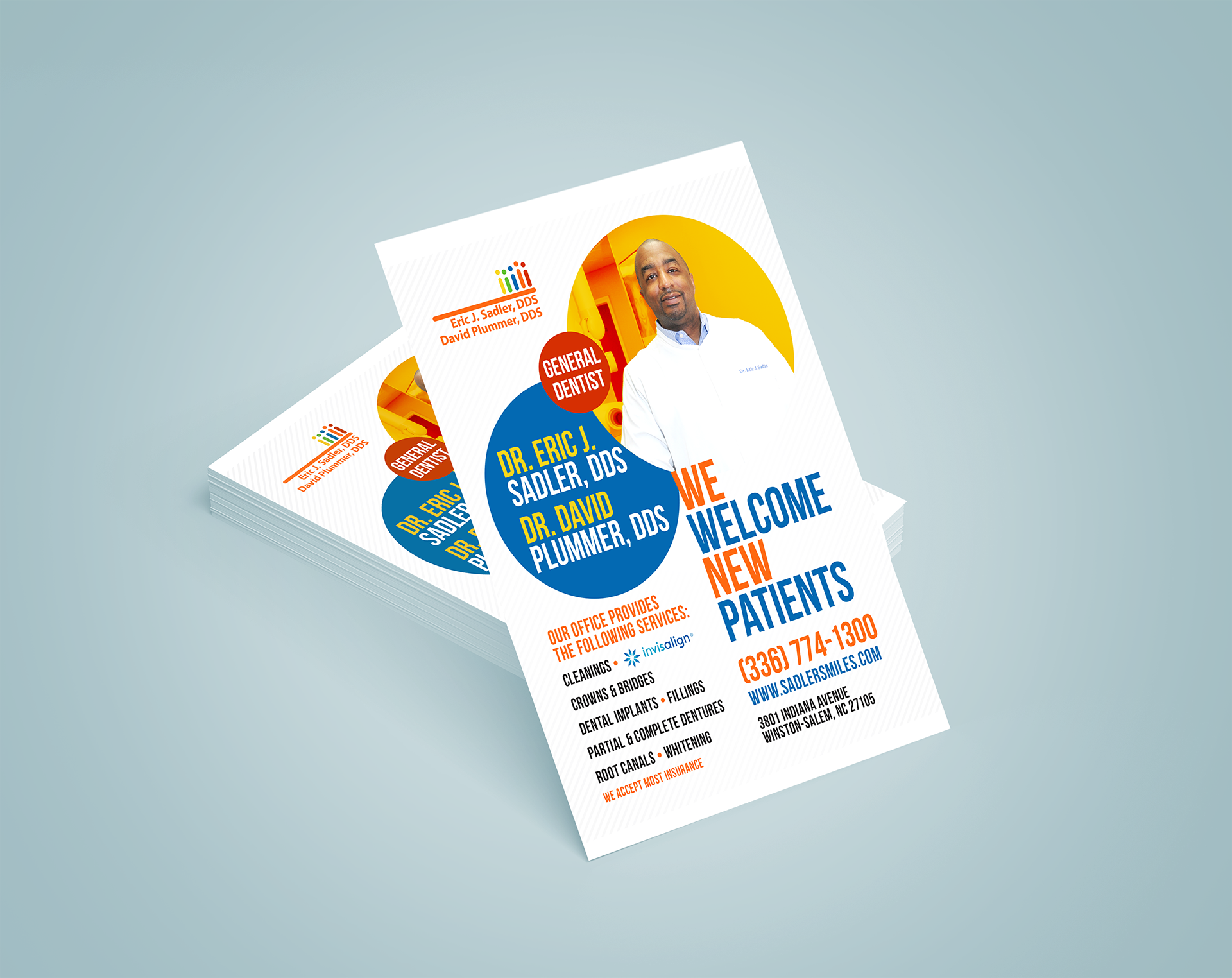
Problem: Competing practices had stronger local visibility due to more aggressive advertising. The practice needed to attract new patients in a competitive Winston-Salem market.
Solution: We designed flyers which featured bold, patient-friendly typography, professional photos of the dentists, and a welcoming “We Welcome New Patients” headline. Flyers listed specialized services (implants, crowns, Invisalign, whitening), positioning the practice as a one-stop shop.
Impact: Community name recognition rose significantly— new patients reported learning about the practice through the flyer. Uptake in higher-value services increased by 40%, particularly for implants and whitening.
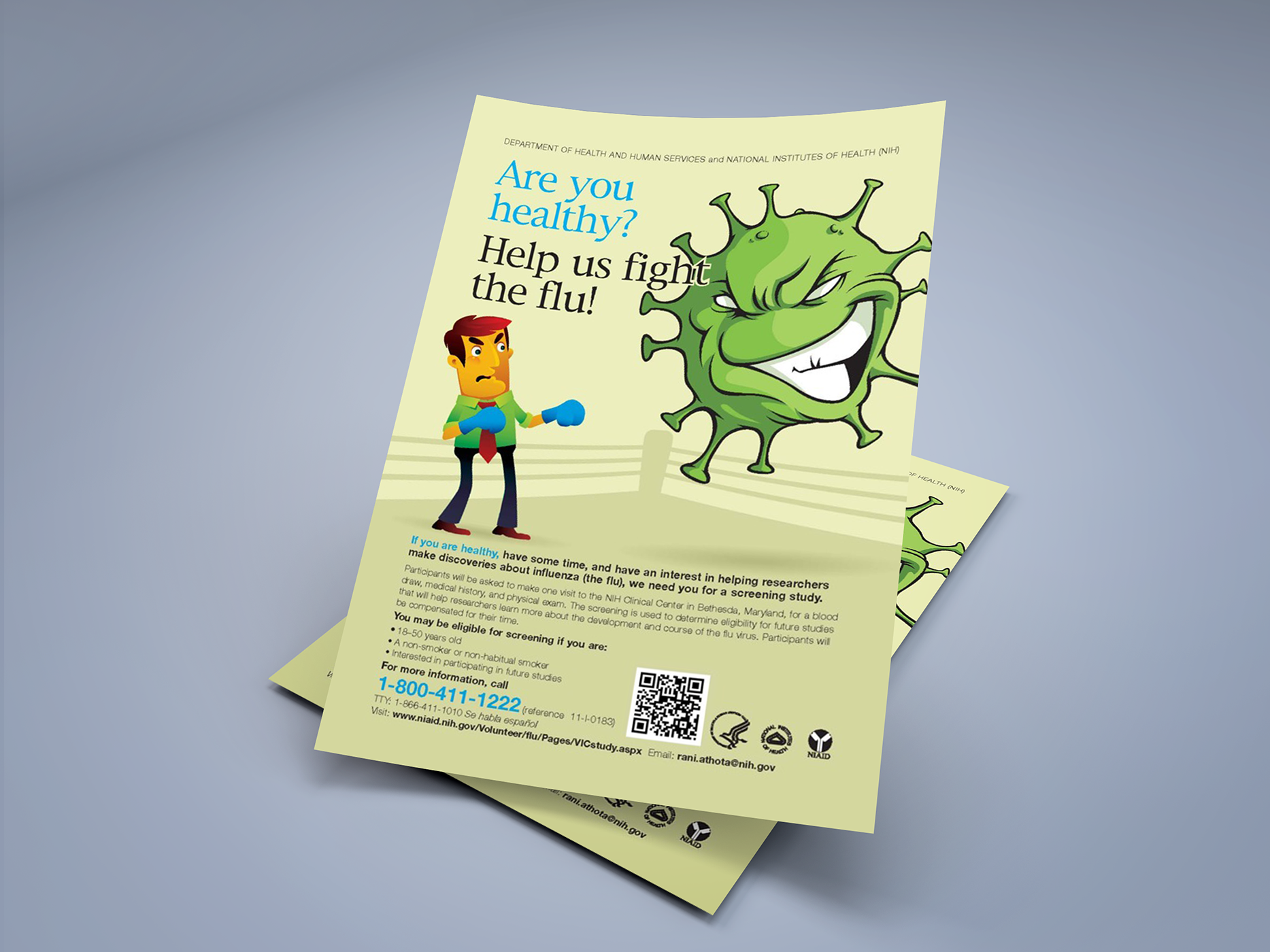
Case Study: Attracting Research Volunteers
Problem: NIH needed healthy volunteers for flu research studies but struggled to present the opportunity in an approachable, non-intimidating way. Recruitment language was previously too technical, discouraging non-medical audiences from participating.
Solution: We created a flyer with cartoon-style graphics, making scientific research feel friendly and accessible. Flyers were written in plain language with bold visuals and a clear step-by-step of eligibility and contact info.
Impact: Volunteer sign-ups increased with enough participants recruited to complete the study ahead of schedule. NIH also reported a 35% increase in return volunteers for future studies.
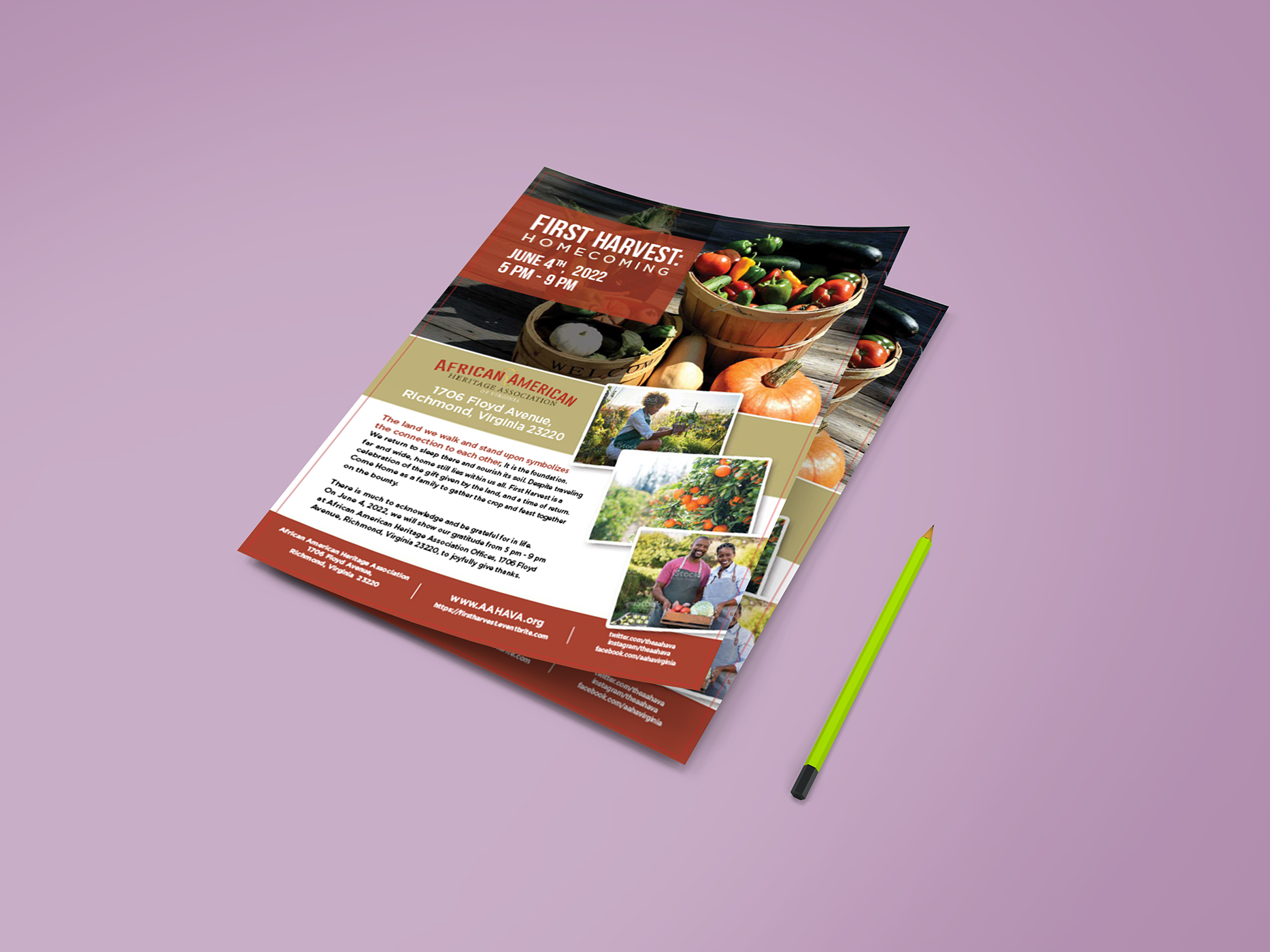
Case Study: Expanding Awareness Beyond the Core Community
Problem: Attendance at past “First Harvest: Homecoming” events was limited due to minimal promotion and plain advertising that didn’t capture attention.
Solution: We designed a colorful, produce-rich flyer emphasizing community, food, and culture, using vibrant photography to connect with audiences emotionally, incorporating family-friendly visuals and clear event details.
Impact: Social media event shares increased by 80%, and vendor participation doubled compared to the prior year. Over 50 first-time families attended.