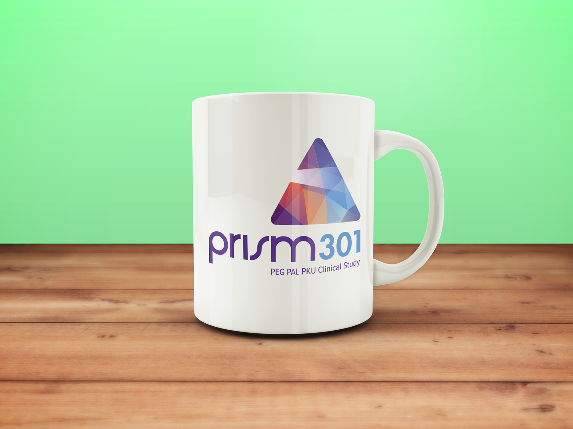
Case Study: Creating a Memorable Identity for a Complex Study
Problem: Adults with rare conditions like Phenylketonuria (PKU) often feel overlooked by the medical community. For the Prism 301 clinical study, the challenge was to overcome skepticism and encourage participation by creating a strong, trustworthy identity.
Solution: We designed a visual system anchored by a triangular prism — symbolizing strength, clarity, and light refracted into new possibilities. The purple palette conveyed professionalism and stability, while gradients added a sense of modern innovation. By extending the design to collateral like mugs, handouts, and digital platforms, we created a cohesive presence that reinforced legitimacy.
Impact: The rebrand directly improved communication outcomes. Recruitment materials with the Prism 301 identity generated 55% more click-throughs to the enrollment page compared to generic versions. Clinics reported that the simplified name made it easier to discuss the study with patients, and overall participant enrollment rose year-over-year.
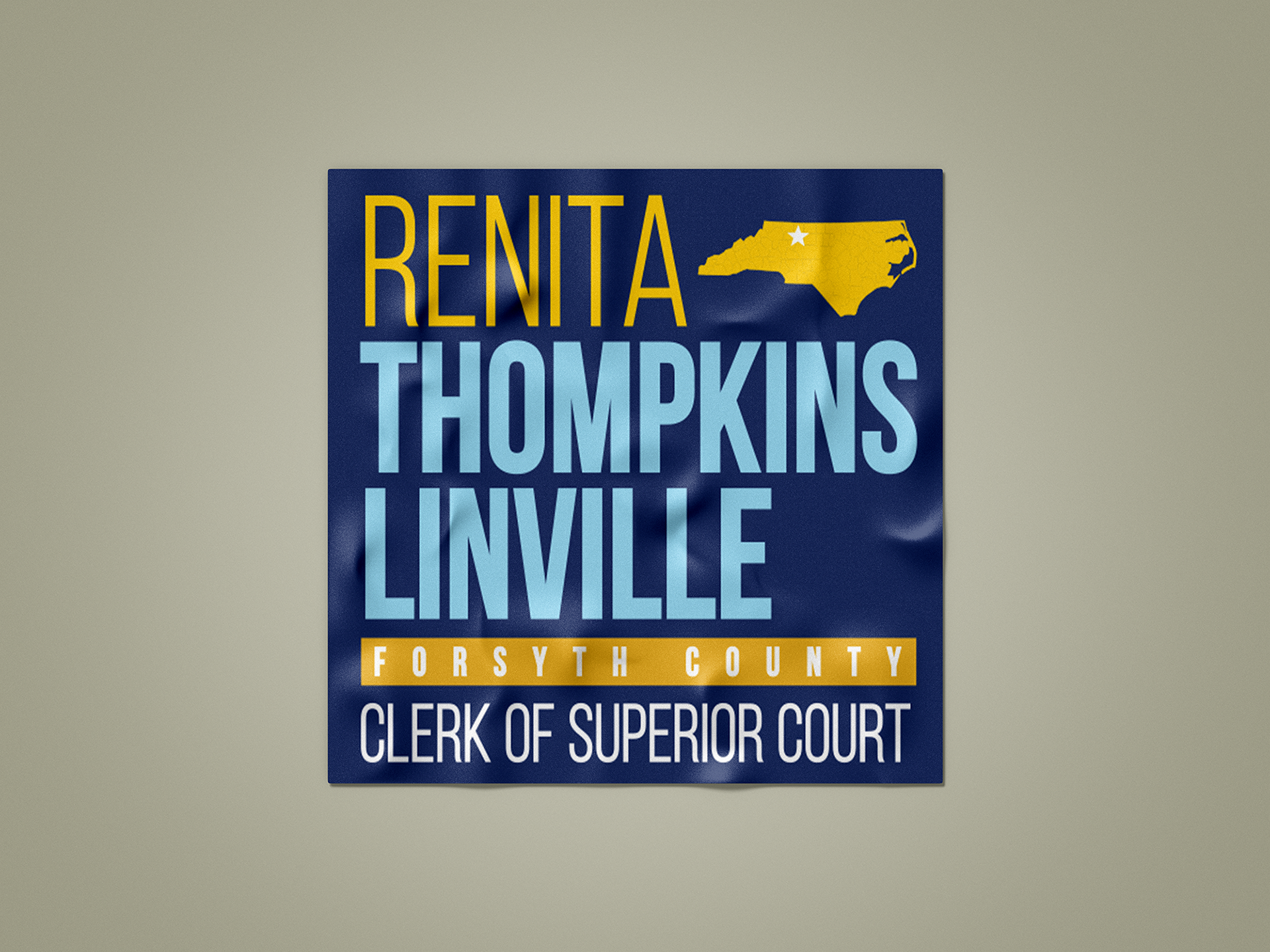
Case Study: Building Trust Through Design Consistency
Problem: In political campaigns, inconsistent branding can erode trust and make a candidate appear less professional. Early in the campaign, materials were fragmented, with multiple color schemes and type treatments creating confusion among supporters.
Solution: We streamlined the campaign’s look into a cohesive brand system. A strong typographic hierarchy emphasized the candidate’s name, while the deep blue background and bright gold accents created a trustworthy, modern feel through evoking regionally known color palates.
Impact: After the rebrand, donor contributions increased by 31%, with several citing the professionalism of campaign materials as a factor in their support. Branded materials were remarked by supporters as being visually superior to competitor materials, ensuring the candidate’s presence was both recognizable and respected throughout the county.
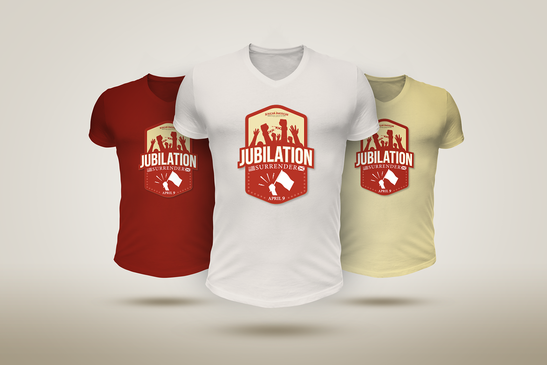
Case Study: Transforming a Local Event into a Recognized Cultural Brand
Problem: The African American Heritage Association needed to elevate the “Jubilation/Surrender” event beyond a local celebration. The lack of a professional, cohesive brand identity limited opportunities for sponsorships, press coverage, and broader recognition.
Solution: We designed a unified visual identity anchored by a bold emblem featuring hands raised for freedom, a surrender flag, and strong typography. The design was adapted across merchandise, print, and digital assets, ensuring the community could instantly recognize and connect with the event.
Impact: Attendance grew to over 100 participants, making it the largest gathering in the event’s history. Merchandise sales grew substantially, providing additional funds for cultural programming. Media mentions increased by 200%.
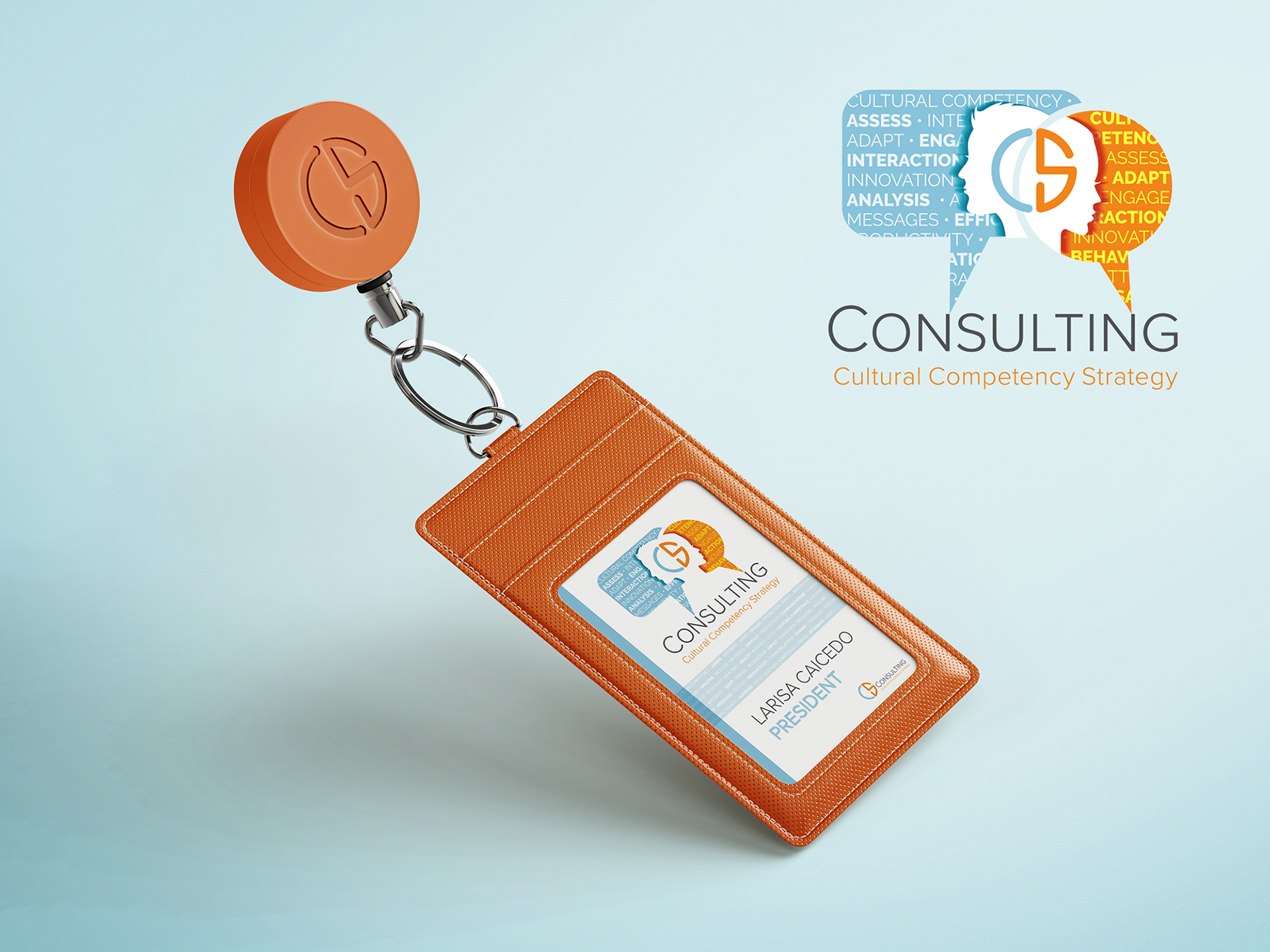
Case Study: Establishing a Professional Brand Identity for Market Entry
Problem: A small cultural competency consulting firm struggled to stand out in a saturated market. Without a distinctive visual identity, the firm risked blending in with generic consulting providers and failing to communicate its unique value.
Solution: We delivered a comprehensive branding package including a versatile logo, color palette, digital templates, and branded ID systems. The design emphasized inclusivity and expertise, making the firm look both approachable and authoritative.
Impact: The cohesive branding helped the consultancy evolve from a boutique practice into a growing organization. Client inquiries increased by 150% after the rebrand launch.