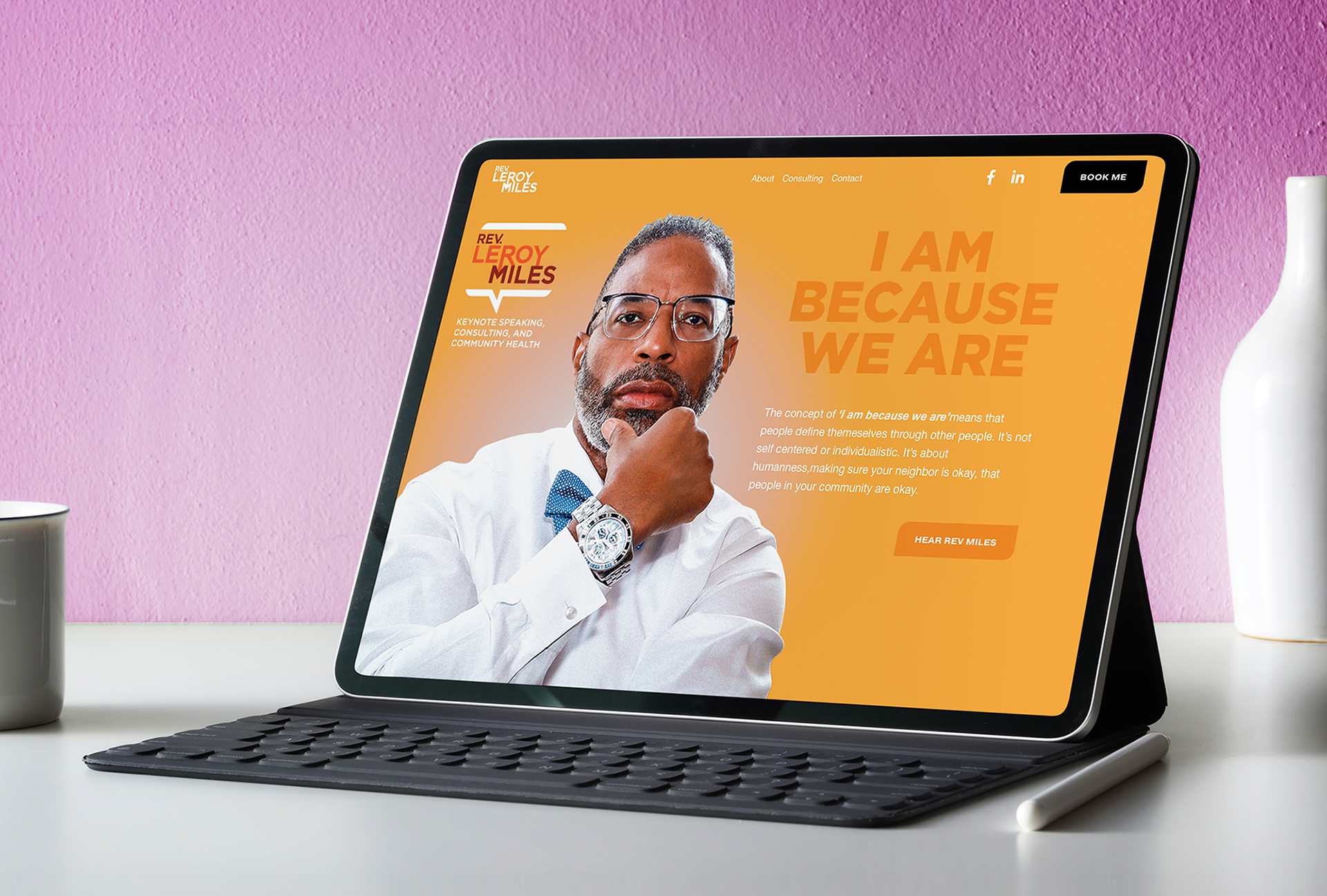
Case Study: Establishing a Strong Personal Brand Online
Problem: Rev. Leroy Miles, a keynote speaker and community health advocate, had a growing reputation locally but lacked a cohesive digital presence. His previous materials were inconsistent, making it difficult for potential clients and partners to understand his full range of expertise.
Solution: We developed a modern branding system centered around his personal philosophy “I Am Because We Are,” creating a logo, color palette, typography, and website, that reflected both professionalism and approachability. The new site showcased his services—speaking, consulting, and advocacy—through bold visuals and intuitive navigation, with a clear call-to-action for bookings.
Impact: The new brand identity unified his presence across digital platforms, leading to a 35% increase in booking inquiries within the first three months. Website analytics showed visitors were 70% more likely to explore multiple pages compared to his old site, while social engagement nearly doubled as his brand became instantly recognizable.
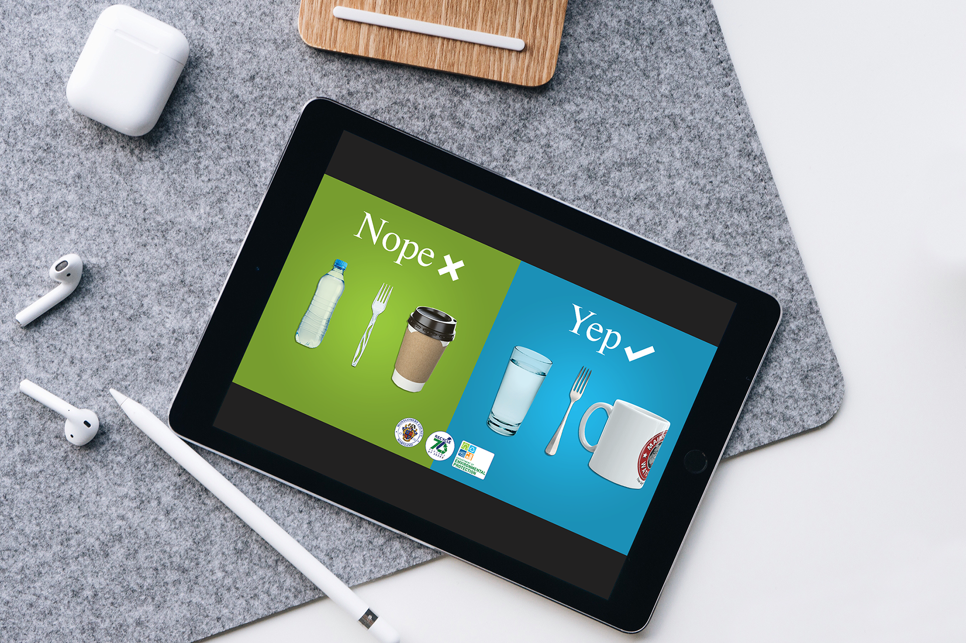
Case Study: Encouraging Behavioral Change Through Relatable Messaging
Problem: Although the county had long promoted recycling, many employees in offices, restaurants, and retail spaces didn’t feel personally accountable for waste reduction. The messaging felt abstract, failing to connect with daily choices like bringing a reusable mug or using a metal fork
Solution: We developed a relatable and behavior-focused design that showcased everyday items side by side: disposable plastics versus sustainable alternatives. The approachable “Nope / Yep” framing made it easy for individuals to recognize small, achievable changes in their routines.
Impact: The campaign led to an increase in employee participation in office recycling programs and a rise in the reported use of reusable containers and utensils. Surveys showed that businesses found the visuals more effective than traditional written guidelines, highlighting the power of approachable, behavior-driven design.
Case Study: Strengthening Client Relationships Through Design
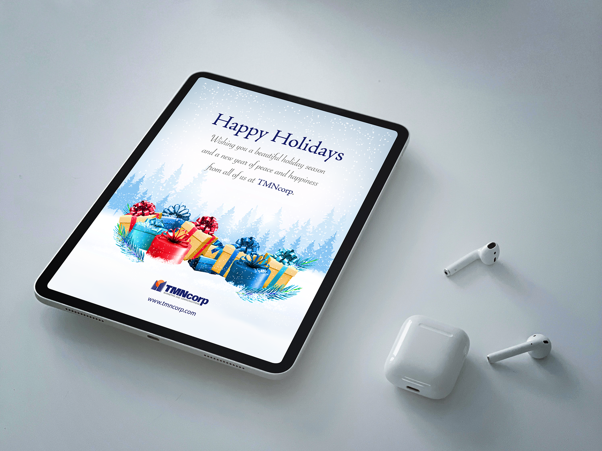
Problem: TMNcorp needed a way to remind clients of their appreciation during the holidays without blending into the flood of generic digital messages sent by other businesses. A memorable design was essential to reinforce their reputation for professionalism and creativity.
Solution: We created a holiday e-greeting card featuring bold, gift-inspired visuals set against a serene winter background. Paired with a heartfelt message and brand colors, the design balanced festive cheer with corporate polish, ensuring TMNcorp’s brand identity remained front and center.
Impact: The greeting stood out in inboxes. Surveys showed that clients felt the greeting strengthened their connection with TMNcorp, with several noting they forwarded the greeting internally — extending its visibility beyond the original recipients.
Case Study: Expanding Reach Across Digital Platforms
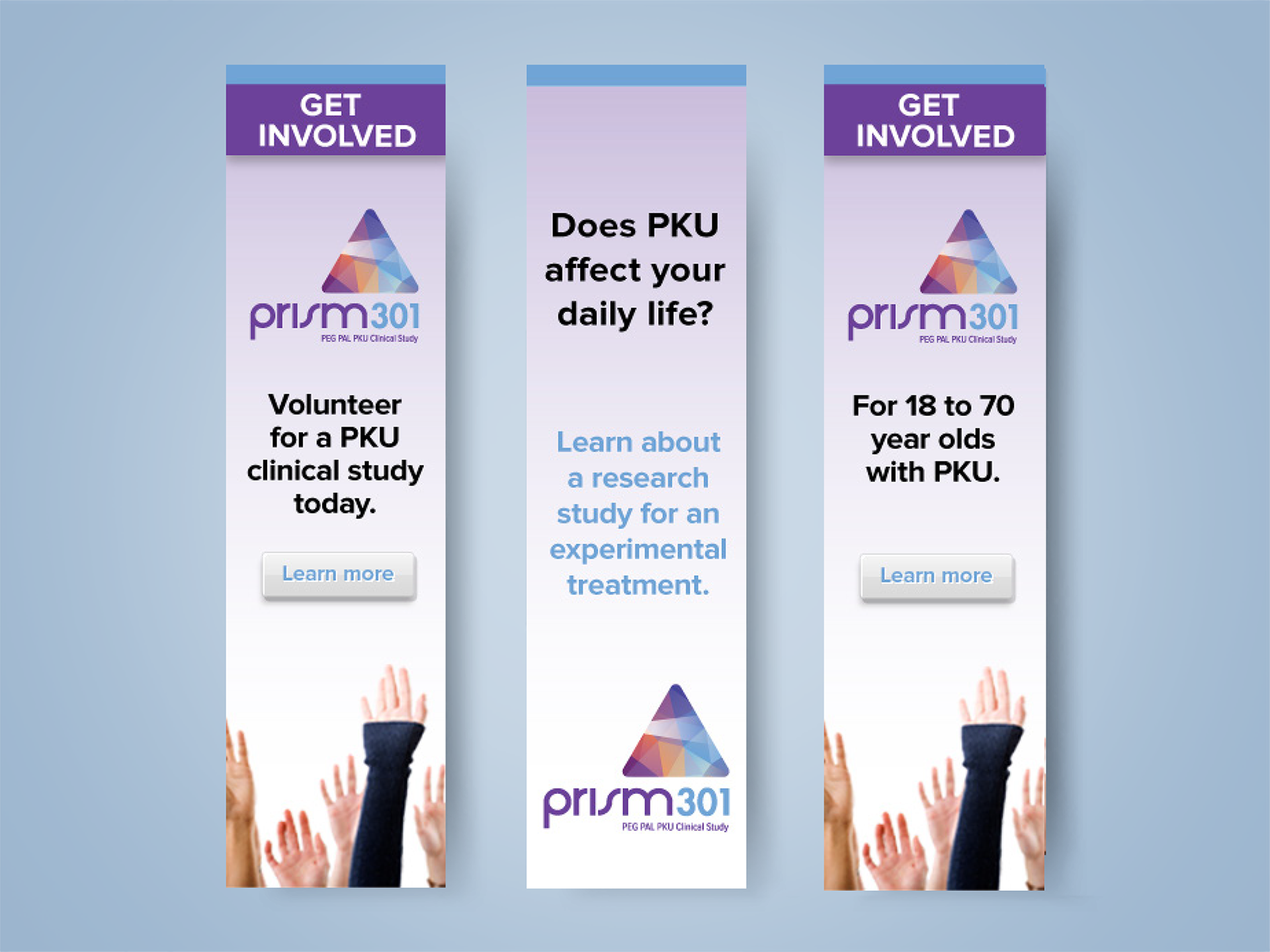
Problem: The PRISM301 trial needed to reach a geographically dispersed patient community. With no single channel capable of reaching all eligible participants, the sponsor required a flexible campaign that could be deployed across websites, patient forums, and social media feeds.
Solution: We designed web banners in multiple sizes, adaptable for use in programmatic ads, community health websites, and social platforms. Their bold headlines (“Get Involved”) and strong visual hierarchy ensured they stood out even in busy digital environments.
Impact: Surveys conducted after ad exposure showed that respondents found the ads “easy to understand” and 63% felt more comfortable considering trial participation. The campaign achieved a 50% boost in engagement among adults aged 18–45, one of the hardest-to-reach Phenylketonuria (PKU) demographics.