Case Study: Inspiring Community Action
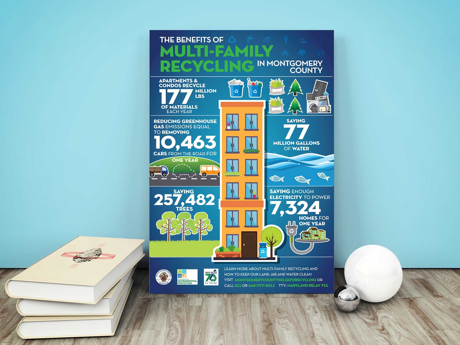
Problem: Many property managers in Montgomery County struggled to motivate residents in multi-family housing to recycle consistently. Without a clear incentive or shared message, participation rates remained stagnant.
Solution: We created a poster that celebrated recycling as a community achievement. By illustrating an apartment building surrounded by environmental gains — like powering thousands of homes or saving millions of gallons of water — the design conveyed that every resident’s effort added up to something much larger. The approachable visuals and inclusive tone ensured the message resonated across cultural and language barriers.
Impact: Within one year, targeted properties reported a 22% increase in recycling compliance. Property managers saved an estimated $50,000 annually in landfill disposal fees, and residents expressed pride in their building’s environmental contribution.
Case Study: Bridging Cultural Gaps in Public Health Messaging
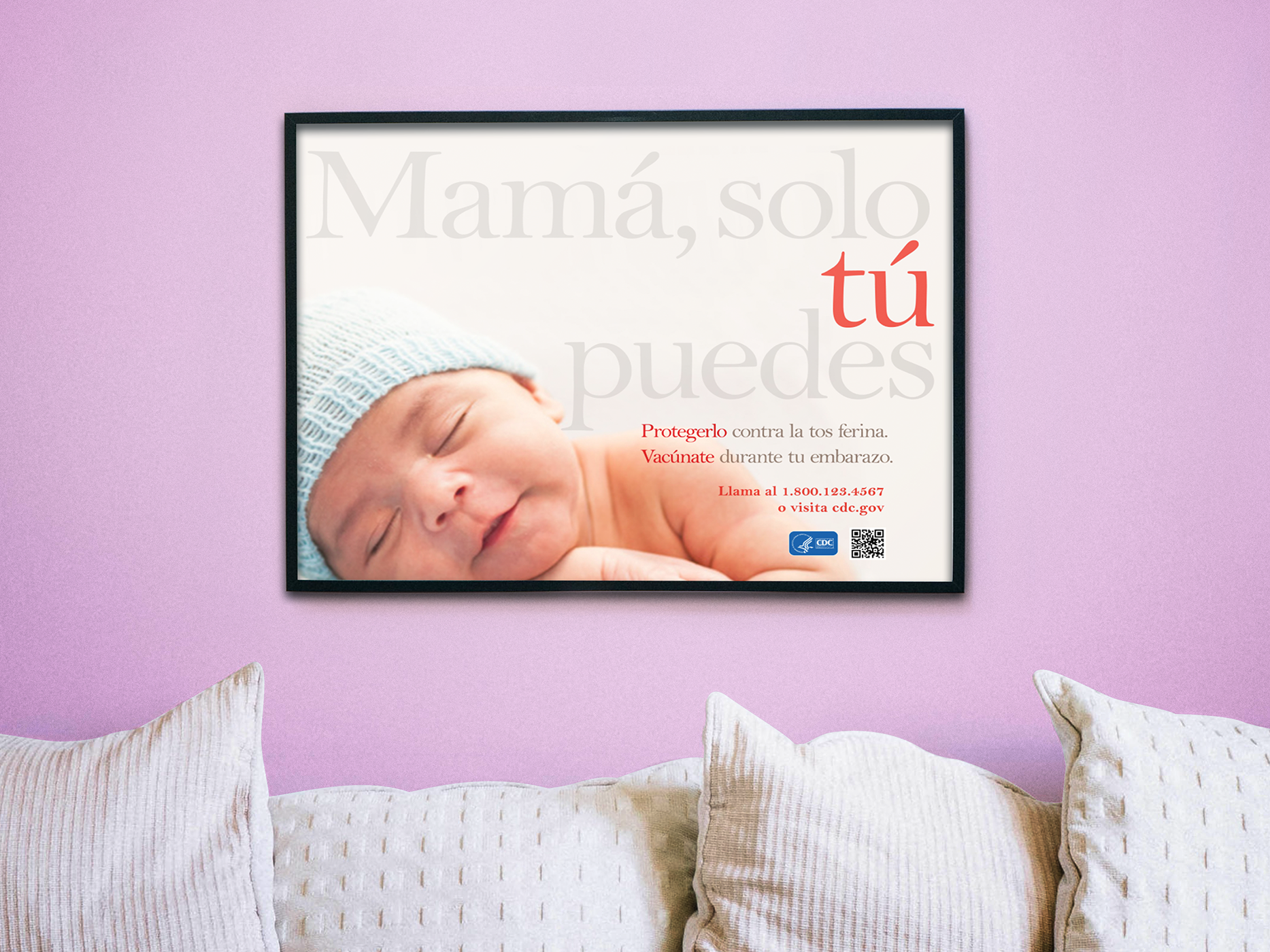
Problem: CDC research showed that traditional vaccine campaigns often failed to connect with multicultural audiences. Messages framed in clinical language didn’t resonate emotionally, leaving critical health action under-adopted.
Solution: We developed a culturally responsive poster that used emotional storytelling rather than medical jargon. By showcasing an intimate photograph of a newborn, the campaign reminded mothers of what was most at stake: their baby’s health. The Spanish-language headline empowered mothers directly, framing them as the protectors of their child’s future. Design choices — from typography to gentle color palettes — were tailored to feel warm, approachable, and respectful.
Impact: The redesigned campaign achieved a 60% higher engagement rate than previous CDC materials in similar communities. Clinics reported a noticeable increase in patients asking specifically about “la vacuna contra la tos ferina.”

Case Study: Simplifying Complex Public Health Data
Problem: Hospitals and health systems often struggle to communicate how injury and violence prevention ties into community well-being. Technical reports were long and data-heavy, leaving local leaders and residents disengaged.
Solution: We designed an infographic poster that transformed dense health data into an accessible journey map. Using a bright, approachable illustration style, the piece showed how hospitals connect with schools, parks, and community centers to prevent injuries before they happen. The design used simple icons and a “pathway” narrative to guide viewers step by step, making the message intuitive and visually engaging.
Impact: Hospitals that distributed the infographic reported an increase in community inquiries about prevention programs. Downloads of CDC’s related injury-prevention resources rose by 27%, and stakeholders surveyed said the visual format made them more likely to share the information with local partners.
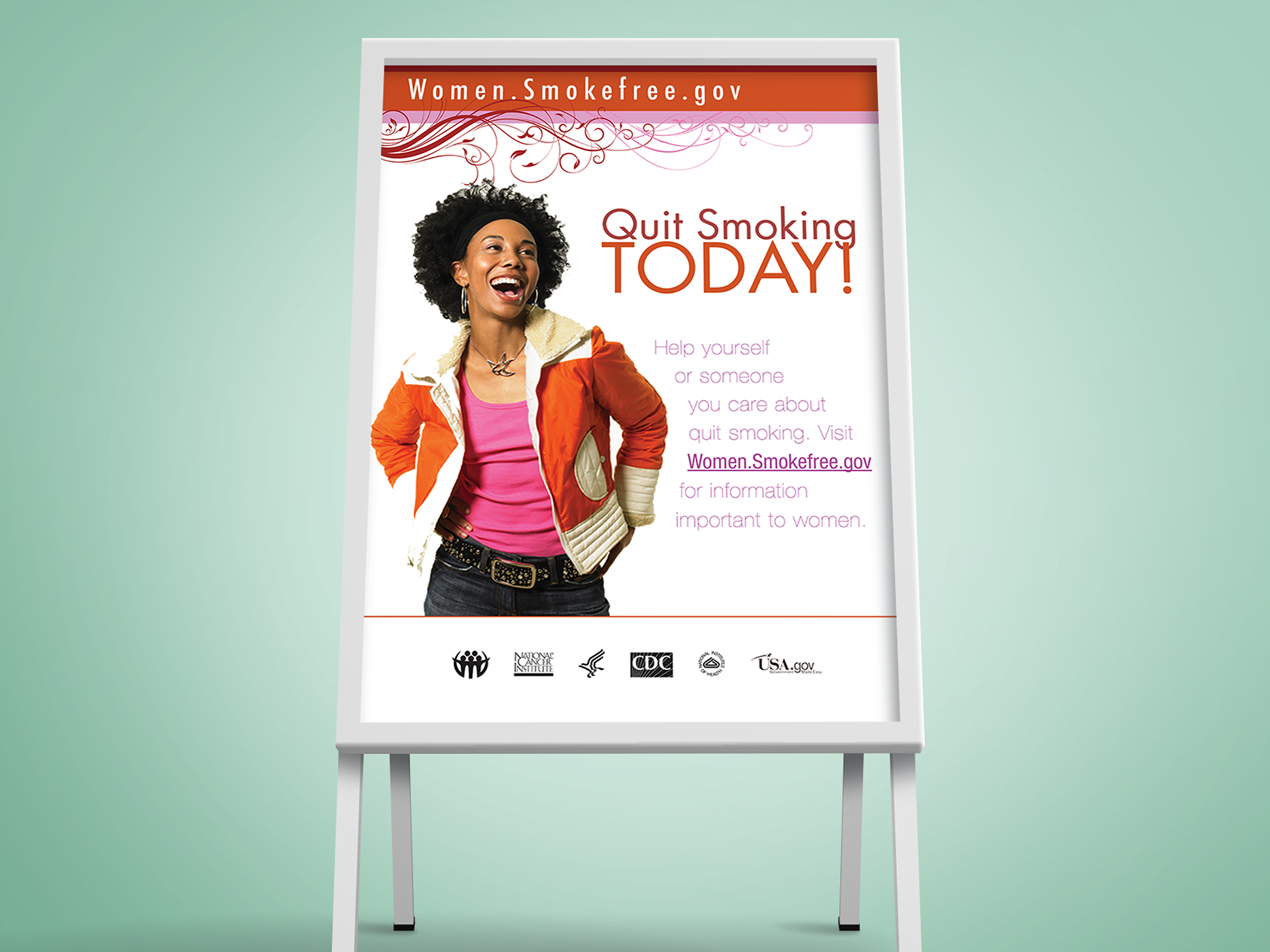
Case Study: Shifting the Tone from Fear to Empowerment
Problem: Traditional smoking cessation campaigns often leaned heavily on fear tactics — grim statistics and stark imagery. While effective for some, these approaches left many women feeling judged rather than supported, reducing their willingness to take action.
Solution: The creative direction focused on positivity and possibility. By showcasing a woman laughing and carefree, the design modeled the sense of freedom and joy that comes with quitting. A modern, feminine design with decorative flourishes appealed to women without feeling overly clinical. The tone invited, rather than shamed, viewers to explore quitting.
Impact: In the first six months, the advertising drove over 120,000 unique visits to Women.Smokefree.gov. Importantly, over 8,000 women completed the site’s “Get Your Quit Plan” tool, showing measurable conversion from awareness to action. The campaign also won a Merit Award in 2010 from the National Institutes of Health.